
How to Choose Colors for a Peaceful Bedroom
Tips on Using Colors for a Restful and Beautiful Bedroom
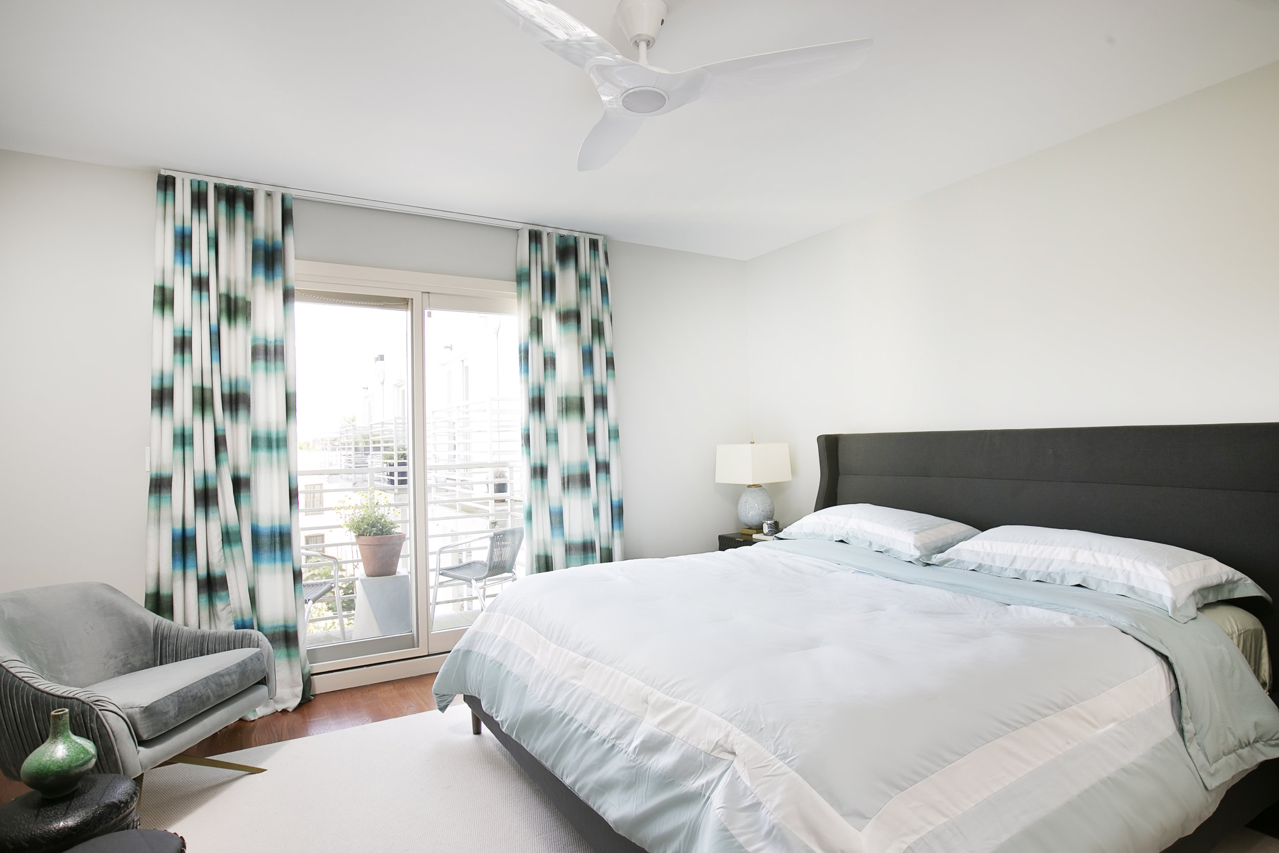
Master Bedroom in our ‘Lovely Lefferts Gardens’ project.
Color has a profound impact on our mood and our energy levels, which is a great opportunity to not only make choices that are beautiful, but also ones that will improve your quality of life through design! When it comes to the bedroom, a relaxing, peaceful environment is key (especially now that fall has arrived and we’ll all soon be in hibernating mode!)
Color has as much to do with preference as science, and in fact, considering how much color is a part of our every day lives, and as noted in this article by Very Well Mind, there has been relatively little scientific study on the phychological underpinnings of color, so understanding some simple color theory in addition to whatever anecdotal ‘evidence’ speaks to you - understanding your own tastes and how a color scheme makes you feel - will be provide the most successful combination for your bedroom.
Below are some examples of how various colors can be used (or avoided) in the bedroom.
Blue!
According to a study of 2,000 Britons by Travelodge, a blue bedroom creates the highest chance of waking up feeling happy, avoiding nightmares, and of getting an average of 7 hours and 52 minutes of sleep a night (of course this last part has a lot to do with what time you decide to go to bed!).
In general - while blue generally has a calming effect, choosing a shade that’s either too dark or too cool can also evoke feelings of sadness, so choose a warmer / softer shade for a bedroom.
Green!
According to Art Therapy Blog, green can be evocative of nature, which to many people will feel energizing, fresh and filled with life. This can also be associated with health and fertility! On the other hand, we’ve all heard the phrase ‘green with envy’ so if you’re using green, try and work those feelings out so you can fully enjoy a restful night’s sleep …
Red!
If you’re using red in a bedroom, it’s advised to make it an accent color rather than the main choice. Red is associated with passion, love and romance (yay!) but also aggression, danger and stress (not so fun). There are so many shades, of course. Darker, burgundy shades tend to evoke sophistication and luxury, while an orangey-scarlet shade can evoke playfulness, and energy, according to colorpsychology.org.

Master Bedroom from our ‘Prospect Park Bright and Cozy’ project.
Yellow!
This is the brightest and easiest hue to for the human eye to perceive. Thus it is the ‘color of the intellect’ according to this site, as it provides clarity, intuition, and aids in memory and decision making. Yellow is said to be ‘more in the head than in the heart’ making it a less emotional and more analytical choice, which may mean that it’s a better color for an office than a bedroom.
We’ve barely scratched the surface of the possible colors to use in a bedroom, but reading through some of the articles linked in this post will surely provide some great ideas and direction. The rest is up to you!
Other Tips!
Whatever color you choose, make sure to use lighter or muted shades of the color in order to make your bedroom as restful as possible. Your accents should also be in complementary colors, rather than starkly contrasting ones, in order to create a restful environment.
It’s advisable to choose a flat or matte paint in order to avoid reflecting too much light for maximal relaxation.
And we LOVE wallpaper or custom window shades in beautiful patterns to create visual interest, and tie in the color scheme.
Lastly, make sure that your mattress, pillows, and bedding are high quality! More on bedding in a different post…